 Features
Eastern Visions: Meet the extraordinary artists merging visual & cultural identities for labels & crews in Asia
Cultural heritage is being embraced in art direction and design across the regional music scene
Since the dawn of dance music as we know it, visuals have played a fundamental role in how artists, labels, collectives, genres and even entire movements, make sense of themselves… Think of acid house, for example, and the iconic yellow smiley face that encapsulated the loved-up spirit of the era involuntarily flashes across your consciousness.

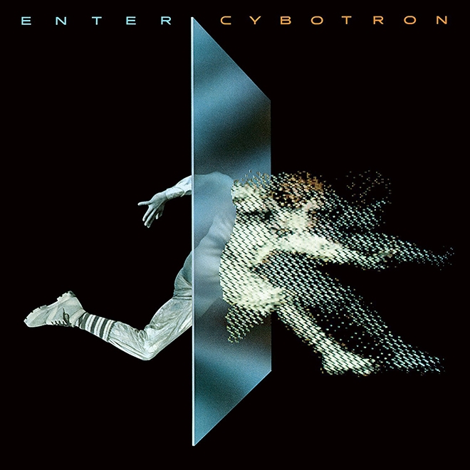
Imagine picking up Cybotron’s Enter in 1983 and already having an idea of what to expect from the foundational techno album just from its cover, which depicts a man leaping through the threshold to dissolve into a flurry of pixels.
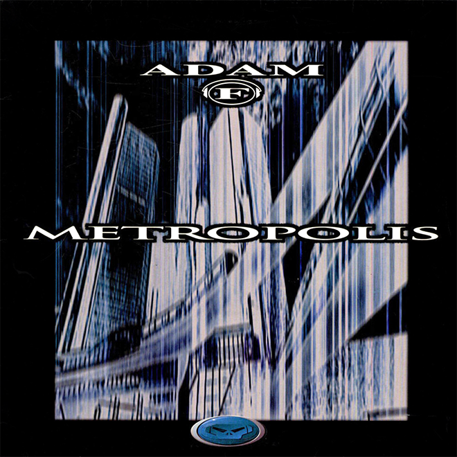
Or take the dark and decaying post-industrial artwork from the late nineties and early noughties drum 'n' bass that musicologist Chris Christodoulou called a “trope for the future as a period of inevitable decline” – images that uncannily reflect back the bass dread that was dripping from productions of the time, such as Adam F’s apocalyptic Metropolis.
Whether expressed through graphic design, photography, illustrations or other mixed media, the relationship between dance music and visuals is akin to a marriage, a statement of intent and a kind of self-fulfilling prophecy. When done right, visuals can contextualise, inform and elevate, and with more ears and eyes turned toward Asia than ever before, labels and collectives in the region have been doing just that with their art direction: forging visual identities for a global audience that draw from and are unabashedly proud of their local and regional heritage.
In this article, we look at some of the design output from a handful of crews in the region that are embracing signifiers, symbols, and traditions from their immediate and broader geographical contexts into their output. From artwork to apparel, these efforts are proving to be an important means by which creatives in music scenes across Asia are asserting their diverse cultural identities.
宀
Established in 2018, Hong Kong venue 宀 (pronounced “mihn”) is now going into its fourth year on the fourth floor of an unassuming commercial building in Sheung Wan. The club, which also doubles as an art gallery space, recently launched an eponymous label that now has two releases under its belt.
宀 takes its name from the Chinese radical for roof or home, and works with Berlin’s Maison C.C. design studio for its club’s art direction across lineups, flyers and socials. The launch of the label, however, provided a further opportunity for 宀 to develop its linguistics-inspired brand and visual identity.

Spearheaded by Taiwanese artist Jill Chien, who conceived the original EP cover concept, the first release set the tone for the artwork aesthetic of the label, which again plays with the written Chinese language, this time by deconstructing the word 基 (foundation). The character is made abstract and is perhaps not immediately recognisable. Instead, its symmetry is offset by the 宀radical popping out at a skewed angle in contrasting green, as well as two of the character’s strokes being stylised as sets of lines reminiscent of music staffs from Western musical notation.
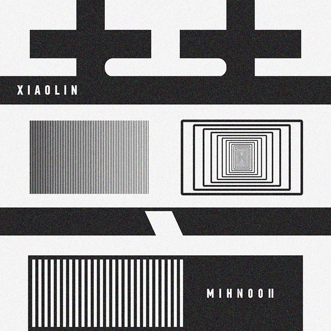
The artwork for the label’s second release, the debut EP from Hong Kong musician and DJ Xiaolin, is designed by Laura Zhang, whose friendship with the artist informed the piece, “I’m really good friends with Xiaolin, so I understood what the music was about, what motivated her and what her inspirations were. I think because of that relationship, it allowed me to express something visually and translate that with something that was quite simple but also has that depth of meaning.”
Released on Chinese New Year day, MIHN002’s first two tracks directly reference the holiday (“Lanterns”, “Lion Dance”), and Zhang brings the theme full circle with her design, which interprets the auspicious character 囍 (double happiness) while also incorporating the club’s radical. “It’s a bit of an illusion,” explains Zhang, “you can see the character [宀], but you can also not see it because it’s negative space.” Add to that the psychedelic graphic lines that suggest soundwaves and the overall effect is one that vibrates perfectly with Xiaolin’s highly personal, powerful and technical club-oriented music.
Siamese Twins Records
Adopting an approach on quite the other side of the visual spectrum, Thailand’s Siamese Twins Records’ art direction is decidedly organic, with all the album artwork drawn by hand by label co-founder Taychin Dunnvatanachit. He maintains that though he is the illustrator, the artwork remains a team effort with fellow label founders Sunju Hargun, Yoshi Nori, and Johan Vandebeek. “It’s definitely very collaborative. We sit down, we talk about what’s going on for each EP's branding because, obviously, you need a great degree of synergy between the music and the art.”
With three releases to date, the label’s curation brings together contemplative, deep and dubby energy with progressive and tribal influences that makes the visual choices all the more appropriate. “A lot of our aesthetic comes from Sak Yan or Yantra tattoos,” says Dunnvatanachit, “It’s a form of very ancient Thai tattoos that came from India and had a lot of Khmer influence. They’re usually meant to either bestow the person who receives them with a certain kind of protection or power, or influence their life somehow. There’s a lot of mysticism around it and it’s still very much practiced in Thailand today.”
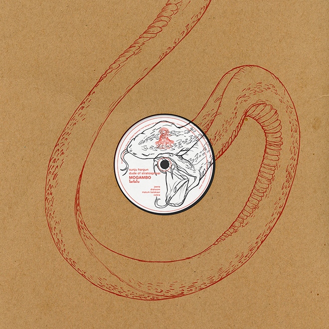
The tattoos, which are performed by shamans known as ruesi or wicha, often feature sacred animals (such as the tigers that make up the label’s logo), and this has informed the illustrations' animal subjects and style: “The tattoos are usually done in solid black ink, they don’t have a lot of gradation or depth to them and they have a very raw, 2D feeling to them, which we try to replicate in the artwork. I use actual pencils for all of them, these are not digital. I scan them in and then I colour them.”
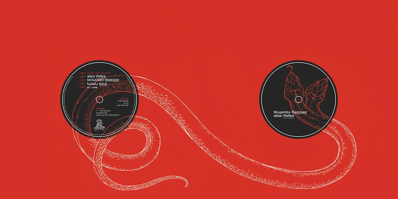
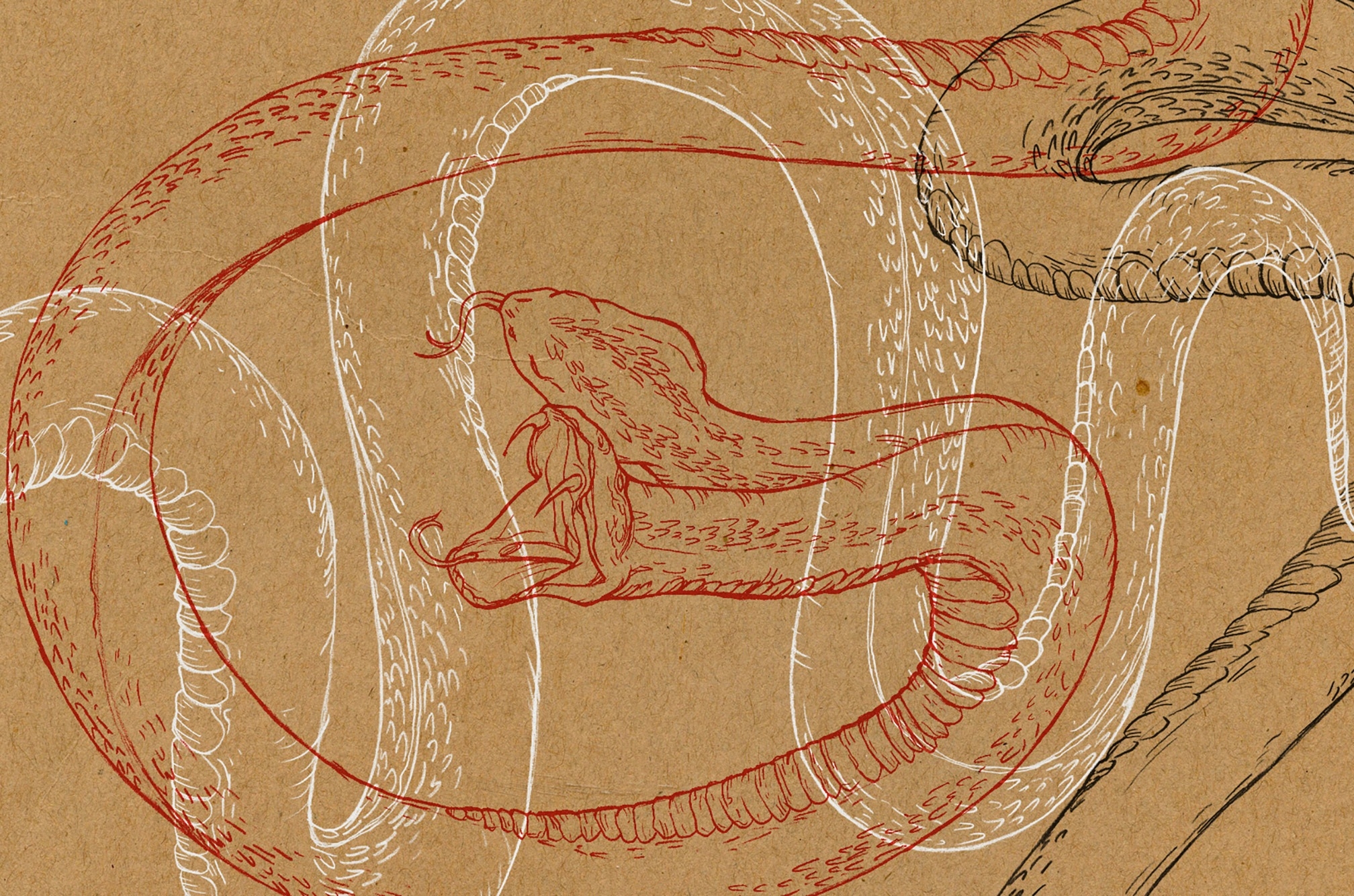
In an homage to Chang and Eng Bunker, the real-life conjoined twins that inspired the label’s name, all the animals from the logo to the releases have two heads. Attention to detail also manifests in the physical releases, with the snakes adorning the Mogambo EP and Remix EP having continuity from the front to the back of the sleeves.
With a colour palette of primary colours and a visual identity rooted in mystical Thai traditions, Siamese Twins Records’ visuals prove to be as elemental as its music…
More Rice
With ties to Bangkok and Manila, More Rice Records is all about fun and wants you to know it, as label co-founder Jay Sriyuksiri tells us, “Our art direction actually plays an important role to our label because we wanted to keep the concept fun and not too serious. This is the whole concept from the name itself to our merchandise.”
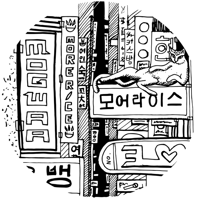
With artists on their roster from different parts of Asia, More Rice gave the illustrators they worked with a wide berth with the release artwork (Sinee Srivikorn worked on the first three EPs; Anna Bautista is responsible for the fourth EP and compilation art). Each cover nods to the producer’s origins, and results are whimsical and delightfully in line with the label’s ethos.
Take the Daze In The Hood EP by South Korean producer Mogwaa, for example, which features a lounging cat in a neon-lit Seoul cityscape, or the Mah Noi EP by Bangkok artist DOTT whose cover depicts a traditional Thai shophouse, complete with sleeping street dog out front.
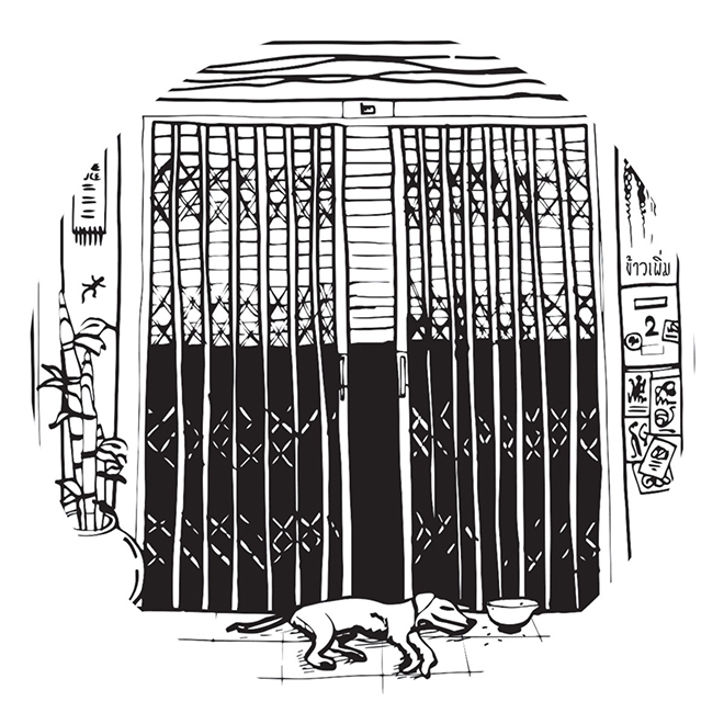
Whether via release illustrations or merchandise (such as their t-shirt design, which plays on the Sriracha brand hot sauce logo), More Rice’s design philosophy is perhaps best summarised by co-founder Jay when he says, “We wanted it to be Asian but also with a hint of cliché.”
Yeti Out
Masters at blending local influences and heritage into their output, we return to Yeti Out in Hong Kong for the last couple of examples. The collective, which is also partly based in Shanghai and London, regularly collaborates with artists for merch drops in addition to, and usually in conjunction with, throwing parties. Each project tells a story, engaging with local culture while staying true to a uniquely Yeti point of view.
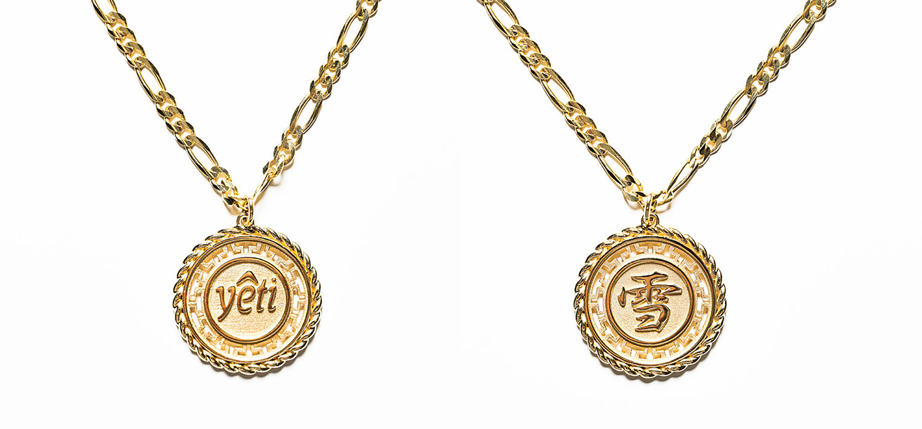
Their most recent drop was a gold pendant and chain modelled on one worn by Yeti Out co-founder Arthur Bray: “I’ve actually got this other necklace that I normally wear,” he tells us, “it’s a silver one that I got from Mong Kok and it has the little Chinese Sino design in the middle, but I kind of wanted to bridge the whole East meets West aesthetic and was inspired by a lot of the sovereign jewellery and UK traditional classic jewellery that has that gold rope finish. I wanted to have that rope element while retaining that traditional Chinese gate crest design, so that’s basically our own edit and then you have the Yeti logo on one side and the character for ‘snow’ on the other, which is up for interpretation,” laughs Bray.
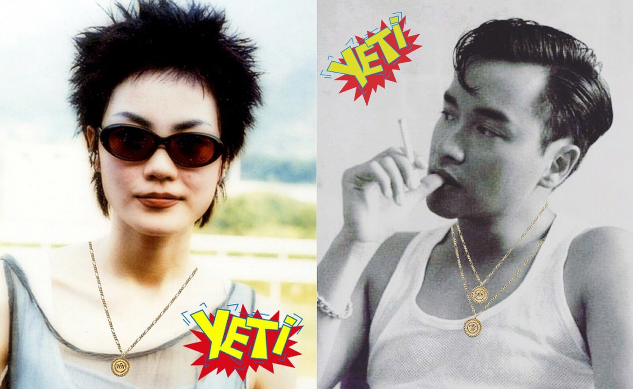
The pendant, which was designed by Yeti Out and is made to order by Vince and BOMS of Original Goldsmiths, and streetwear label PANIC CLOTHING, was accompanied by a campaign on Instagram that plays on a nostalgic Hong Kong pulp phenomenon. “If you grew up in Hong Kong in the early 2000s, everyone used to buy these Yes! Cards. It was part of this media publication where they put out magazines and then you’d get these cards with it, but you could also buy them from machines in shopping malls. They became collectibles because you had all the idols on them, so yeah we bootlegged that and added the Yeti thing,” Bray explains before joking that he is grateful for all the celebrities’ “support” of the pendant.
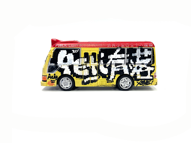
Followers of Yeti Out will also remember last year’s collaboration with legendary Hong Kong graffiti artist Xeme that was the crew’s love letter to the city’s iconic minibuses. Arthur enthuses, “I love the red minibus because it sort of lives in this grey area of, like, is it legal, is it illegal, is it run by gangsters, are they on ketamine? We don’t know, right? I think the whole thing is brilliant, it’s like the Hong Kong version of the Filipino jeepney, the Bangkok tuk tuk, and I think we need to celebrate it.” He continues, “I’ve always thought it was really powerful seeing people paint trains, but we don’t have that sort of train-painting culture, so I hit up Xeme and said, ‘Look, why don’t you paint this red minibus toy that I bought from Sham Shui Po instead?’”
“We made that the key visual and then built a party around it. The whole Yeti thing is we don’t just want to be a party for the sake of a party. What are we celebrating? We’re celebrating Hong Kong culture with an all-Hong Kong line-up.”
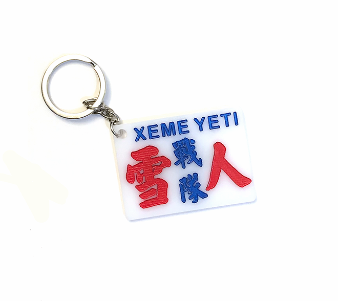
The project also collaborated with local artisan Uncle Mak who has been hand-painting minibus signs since the 1980s, interviewing him in addition to commissioning a custom minibus sign from him which was later reproduced on tees and keychains.
These examples are but the tip of the iceberg of design activity in the region being propelled forward by labels, crews and collectives that are making imaginative use of the wealth of cultural images and influences surrounding them, and doing so with pride.
